Webdev Misadventures

Ryan Batubara 7 min read #programming

Web development is a mess. Here's how I made this website.

Webdev Misadventures

What I want from a website

Web development is a mess. In my previous attempts at a portfolio and/or blogging site, I’ve always spent more time fighting the “features” of some template rather than writing actual content. Here are some examples of such “features:”

  • A comments section, e.g. Giscus or Disqus. For most blogs, this is a moderation liability.

  • Content management systems (CMS). Good file management and naming conventions are enough for me. I don’t want to be forced into any CMS idiosyncracies either.

  • Share buttons. I have never used these.

  • Analytics like Umami. This is just overkill.

  • Newsletter integrations. RSS is enough.

  • Too many prebuilt components, e.g. twenty different carousels. It’s just overchoice. If I need a component someday, I can make or look for one then.

  • Multi-author management systems. Git and pull requests suffice.

  • Too many libraries. Why do you need shadcn, MUI, DaisyUI, and RadixUI?

On the other hand, there are some features I consider essential to any website:

  • constants file(s). Both for styling, e.g. a single .css for all colors, and component data. More on this later.

  • Open Graph metadata, and other basic SEO features. Its good for searchability.

  • Affordable navigation stuff, e.g. a navbar, table of contents, etc.

For blogs in particular, I consider these features essential:

  • Math equation support, e.g. via KaTeX.

  • Code blocks with syntax highlighting, e.g. via Shiki.

  • Mobile support. That is, everything resizes without losing functionality.

  • A table of contents that’s always accessible. These should not just be at the start and end, even on mobile.

  • Separation of content and style. I should not be styling components in the same file as my post text data.

    • On that note, .mdx or similar for content. Not .md. I should have easy access to JavaScript even in my content files, for components and the like.

What this website has

This site is built off Erudite. It satisfies every requirement above, with only minor modifications. Its design document significantly overlaps this one. I strongly recommend this template.

Let me show off this site’s features using a continuous article series. Each part is rendered on this page when you follow any of these links:

  1. The technicals

  2. Styling and typography

  3. Components

The Technicals

Ryan Batubara 3 min read #programming

Why Astro? Why mdx? The tech stack.

Why Astro?

From the start I knew I wanted Astro as my web framework. There were three main reasons for this:

  1. UI-agnostic. Astro allows you to use React, Svelte, Vue, Solid, etc all in one site. As someone new to web development, this means I can try all the UI frameworks without committing to one early on.

  2. Server-first. In Astro, the server renders as much content into HTML as possible. This is ideal for static sites like blogs.

  3. Islands architecture. Astro separates each page into different islands or components, each of which can be static or interactive and use almost any UI framework. This is performant while allowing me to choose the best framework for each component.

I didn’t want to start from nothing, so I went through every blog template on Astro themes. Erudite was the best fit at the time.

Note (An anecdote on Erudite)

Erudite claims to be loosely inspired by Astro Micro, which was a fork of Astro Nano. Astro Nano was actually my second choice template, since it had precisely the bare minimum for a quality blog and nothing more. Astro Micro added search, comments, and other features to Astro Nano, alongside a visual overhaul. For me, Erudite took the best principles of Nano and Micro, got rid of everything else, and added the ideal post navigation system.

Enscribe, the creator of Erudite, has a blog that exemplifies Erudite’s potential as a technical blog. Reza Rezvan’s blog exemplifies Erudite’s potential as an academic blog. He’s also the original author of the <Callout> component, which was eventually merged into Erudite.

Since then, I’ve actually gotten in touch with Enscribe, who ended up being very influential in determining the color palette for this site and getting me to use Figma. I’ve also borrowed (stolen) many webdev tricks from him since then.

The tech stack

Astro is the web framework, with MDX as the main content format. Satteri is the Markdown/MDX pipeline. Temml renders math, and Expressive Code handles code. The site is written in TypeScript and hosted on GitHub through GitHub Pages.

The flowchart for a typical blog post is:

  1. Brainstorming a topic. Surprisingly the easiest part.

  2. Making the post’s banner art in Figma. This is second because I find illustrating forces me to concretely narrow down the topic in a way text cannot do.

  3. Writing directly in .mdx using an IDE. This takes the most time.

  4. Making custom components for the post. It’s my unspoken rule to always make a new component for every post, both to practice reviewing AI-generated code and to give each post some individuality.

  5. All this is done in a Github branch. When the first draft is ready, I make a pull request. If a post needs edits after that, I do it in the same branch and PR it back into main.

The Git branches allow me trace what post inspired what change, and work on multiple posts simultaneously.

On media

I try to store all images in WebP if its not a vector and SVG if it is. I’m having doubts about SVG though. Inspect the blog post banner file size and you’ll see why. I hope to never upload a video or large media file directly here, providing links to an external service instead.

Styling and Typography

Ryan Batubara 2 min read #programming

Colors, fonts, and more. The fancy stuff.

The color palette

I spent more time thinking about the site’s color palette than any other design decision. This was largely because I wanted a palette that:

  1. Had a primary color that was visible in both light and dark mode.
  2. Had a primary color with many subtle shades, making light and dark mode palettes easy.
  3. Had a wide available color gamut on most displays.

I did this by experimenting with okclh(L C H / a), which controls

  • L, perceived lightness, dark to bright [0,1];
  • C, chroma, dull to vivid [0,∞);
  • H, hue, or the color angle in polar coordinates [0∘,360∘];
  • a, alpha, transparent to opaque [0,1].

To create a cohesive palette, I wanted all colors to have the same hue color. Furthermore, between dark and light mode, different colors should have the same relative chroma, but have “inverted” lightness.

I’m still working on this, but here’s what I got so far:

backgroundoklch(0.9941 0.01 130)foregroundoklch(0.12 0 130)primaryoklch(0.5 0.1 130)accentoklch(0.75 0.07 130)inline-code-backgroundoklch(0.88 0.035 130)block-code-backgroundoklch(0.7 0.055 130)mutedoklch(0.9 0.03 130)muted-foregroundoklch(0.18 0 130)borderoklch(0.9 0 130)ringoklch(0.7 0 130) backgroundoklch(0.12 0 130)foregroundoklch(0.9941 0.01 130)primaryoklch(0.5 0.1 130)accent oklch(0.15 0.2 130)inline-code-backgroundoklch(0.2 0.035 130)block-code-backgroundoklch(0.11 0.03 130)mutedoklch(0.2 0.1 130)muted-foregroundoklch(0.85 0.01 130)borderoklch(0.25 0 130)ringoklch(0.9941 0.01 130)

Styling images

Black and white images are automatically inverted on light/dark mode though CSS’ invert.

Post banners get special treatment. The art, text, and watermark are stored as an svg with transparent background. Between light and dark mode, I just swap out the background color. Here’s what the banner looks like on both themes:

Unfortunately, open graph previews don’t work well with this. So I supply the same banner with background for this.

Styling text

Almost all Markdown syntax is built-in. This includes bold, italics, equations, and code. Satteri feeds both inline and block code into a shared Expressive Code renderer. Spoiler tags like this are custom inline components.

Sections are done with #, ##, and so on. Tables are just like markdown:

Column 1 Column 2
Value 1 Value 2
Value 3 Value 4

Code blocks are styled by Expressive Code, which allow me to do things like:

line-markers.js
function demo() {
console.log('this line is marked as deleted')
// This line and the next one are marked as inserted
console.log('this is the second inserted line')
9 collapsed lines
console.log('C')
console.log('O')
console.log('L')
console.log('L')
console.log('A')
console.log('P')
console.log('S')
console.log('E')
console.log('D')
return 'this line is marked and all code in between is collapsed'
}

Typography

The current default fonts are the variable IBM Plex Sans and Mono. It used to be Inter, which I think looks slightly better than IBM Plex. However, Inter is unfortunately very generic and overused right now.

Serif vs sans-serif was an unexpected point of contention in this website’s design. Half of the people I asked feedback from preferred sans-serif, because it looks modern and clean. The other half argued serif was more academic and better suited my purposes.

Here’s a screenshot of an old version of the site with serif font:

Honestly, I thought it looked disgusting and too much like the default font.

Other typography things: Titles are in titlecase. Sections have the first word and proper nouns capitalized. All files and technical names should be slugified (lowercase with - as spaces).

Components

Ryan Batubara 1 min read #programming

Callouts, widgets, and others. Reusable ploppables.

How to use components

Within any .mdx, import a custom component and pass in the required parameters. Callouts are lighter-weight Satteri directives and need no import:

:::important[About callouts]{closed}
Callouts signify different types of content to the reader
:::

Here’s how it looks rendered. Notice the closed attribute makes the callout closed by default, ideal for e.g. solutions to puzzles.

Important (About callouts)

Callouts signify different types of content to the reader

I can then call out the component as a hyperlink. Here’s how this line looks in code:

I can then call out the component as a [hyperlink](#about-callouts).

By default, the callout’s id is its slugified title, but an explicit directive ID can be supplied too.

Callouts

Callout color and icons are data driven, so it’s easy to add a bunch of varieties:

Variant Usage
noteGeneral information or comments
tipHelpful advice or shortcuts
warningPotential pitfalls or misconceptions
cautionDestructive or harmful actions
dangerDestructive or harmful actions
importantCritical information
definitionTerms or concepts
theoremProven mathematical statements
lemmaHelper theorems
proofLogical arguments
corollaryResults following from theorems
propositionImportant minor statements
axiomFundamental assumptions
conjectureUnproven statements believed true
notationNotation explanations
remarkAdditional comments
intuitionIntuitive reasoning
recallPreviously introduced material
explanationDeeper insights
exampleConcrete examples
exercisePractice problems
problemProblems to solve
answerShort answers
solutionDetailed solutions
summaryKey-point summaries
puzzlePuzzles and brain teasers

Post-specific components

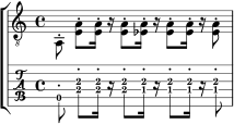
Almost every post has a custom callout made just for it. For example, here’s a music sheet component using LilyPond with tablature support:

A Felicidade excerpt with standard notation above guitar tablature

LilyPond engraves the score during the site build, so the page ships a compact SVG rather than a browser-side music renderer.

Here’s a logic grid component for my post Logic Grids as Data Structures:

NamesAges
AmyBintangChandra789
Birthdays April
January
September
Ages 7
8
9

It’s fully functional and inputs persist even over page reloads.

I want each post to have at least one unique component. I think it adds a lot of interaction and individuality.